Friday, March 23, 2012

Emily's Book

Hi all:

So, after I got all three of my cards done for the Stamping Royalty challenge, I started to focus on other projects that were lined up.

Last year, I experimented with making some small graduation albums for my nieces and nephew.  They measured about 5" x 5", making them small enough to be pretty portable if they wanted to take them to school. I'm not sure if they ever used them (they are teenagers, after all), but the adults seemed to appreciate all of the effort that I put into the albums.  :)

This year, my mom asked if I'd do one for my cousin's daughter, Emily.  I promised her I'd get started with it as soon as the cards were done for the challenge.  Tonight, I finished it.  It was kind of fun to do this album for Emily, as she is graduating from my alma mater.


 That's our little mascot - the Lakota Raider.  :)  I got him off the Raiders' facebook page.  I printed him, cut him out, and then highlighted him with glossy accents.  The words were printed off and cut to fit the matted piece.


The corners of the striped paper were punched with a Martha Stewart punch, then blue cardstock was placed behind the punched corners to bring out the detail.


I like how this page turned out.  The matted areas can be used for pictures, memorabilia, or journaling.  These are different colors of cardstock, one matted on top of the other.  A couple of them were highlighted with patterns using a white gel pen.


I drew the volleyball and then filled it in with glossy accents.  The words were printed out in blue ink and then matted on matching cardstock.


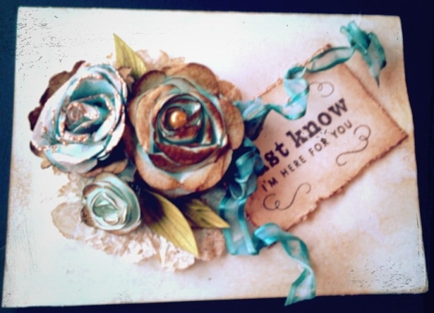
The paper lace was cut out with a Fiskar's punch called "lace".  The tag was cut with a spellbinders die.  The pearls were colored with a copic marker and the words are handwritten.  The page on the left is actually a pocket page.  I like to include pockets to catch things the folks might not want to glue into a book.


Just cardstock and blue glitter letters.  I included all of the textspeak to make it more teen friendly.  :)


Emily was in the school play this spring.  The rose under glass is hand-drawn.


 The paper with the lace edges is punched with a Martha Stewart "Punch Around the Page" set.  The word is printed off and then adhered to the page.

I hope Emily enjoys filling this with all kinds of memories from her senior year.

Take care ~
Kathy


Thursday, March 15, 2012

Spring Bird

From time to time, Michaels schedules In Store Demonstrations.  This past Tuesday, the demo was called Decoupage Egg.  Here is my rendering of this craft project.


The instructions called for the use of a wooden egg.  Unfortunately, all of the wooden eggs at our local Michaels store were recently marked down for clearance and they were all gone.  We decided to substitute a styrofoam egg.  

Step one was to decoupage the scrapbook paper with the music notes on to the egg.  This was probably much easier to do on wood.  The porous texture of the styrofoam didn't allow the Mod Podge to stick very easily.  It helped to tear the paper into smaller pieces and be very patient.  

The egg is resting on a wooden napkin ring, painted white, and sprinkled with Martha Stewart's Sugar Cube iridescent glitter.  Spanish moss is glued on top of the napkin ring and the finished, decoupaged egg is hot glued on top of  the moss.

The bird and the flourish were supposed to be cut with dies, but neither the store or I had the necessary dies.  Instead, I sketched the bird and the flourish to the best of my ability, transferred them to colored paper, and cut them out by hand.  They were both sprinkled with the same glitter before adhering them to the egg.

The final touch was the ribbon and bow.  The ribbon is wrapped around the egg and glued.  I made the bow and hot glued it on separately from the ribbon.  This whole project can be made for right around $10 or less.  

I thought it looked very springy and Easter-y - a cute little decoration on a side table or as place holders for Easter dinner.  Once supplies are purchased, you could make several of these little guys from the same sheets of paper, bags of moss, and spool of ribbon.

A few more shots....


Enjoy this lovely summer-like weather we're having!  :)

Take care ~
Kath

Wednesday, March 7, 2012

Cure for the Winter Blues

So, last night I'm reading through the blogs and websites on my Google Reader list.  I like to read "A Blog Called Wanda"  (check it out here).  She was talking about The Cure for the Winter Blues Challenge at Moxie Fab World.  I followed the trail of breadcrumbs and was shortly off on another project.

Yesterday, I was thinking that I didn't really have anything creative in the works at the moment.  I've been so busy getting ready for Open House and doing the samples I needed to get done that when Open House was over, I suddenly found myself with some choices and had to step back a bit to look for direction.  This Winter Blues Challenge came at the perfect time and it really did challenge me a bit.

I'm not a huge fan of navy blue.  It's "professional".  I mean, I don't hate it, but I generally don't use it to decorate and I don't dress in it.  As a consequence, I'm kind of short on navy blue items in my stash.  Was I up to this challenge?  Did I even have enough to create something worthwhile?

Winter.  Navy blue.  Night sky.  Crisp.  Clear.  Cold.  Peaceful. "In the stillness of a frosty winter night....peace."  Love that, but...too Christmas-y.  (And in the end, too long for my project.)  Oooo...a Tim Holtz stamp with three pine trees in silhouette.  I can use that.  And.....Martha Stewart's Silver Ink Pad.  Oh, here's some muted silver paper and some glittery snow white paper from the Immortal Stack by Die Cuts with a View.  Oh, yeah...now I'm on a roll.....

I started with white cardstock then layered the silver and the white glittery paper on top, finishing the base of the card with a navy blue layer.  I did find a nice shade of navy blue from Recollections by Michaels, by the way.

With the base layers complete, I pulled out the silver ink pad and inked up the stamp with the three pine trees on it.  I made two impressions.  The first layer was bolder, of course.  To bring one tree out to the forefront, I filled it in with a silver Sharpie paint pen.  Stamping again without re-inking the stamp created the lighter impression, giving the look of trees in the background.  I inked the stamp up again, and stamped a piece of white paper.  I cut out the center tree, colored it in with the silver Sharpie paint pen, and popped it out with some tiny foam pop dots.

To create the look of the hills in the background and write the words, I used a white gel pen by Gelly Roll.

The "stars" are dots made by the silver Sharpie paint pen.  Three Swarovski crystals by Jolee were added for sparkle.  I finished the card off with a sheer navy blue ribbon from Michaels.

Enjoy my cure for the winter blues...  :)


Do be impresssed, won't  you?  It took me forever to get that "star" (crystal) to twinkle just right!  :)


I took this one so you could see the silver trees.  In quite a few of the pictures, the trees looked white.  You can also see two of the crystals in this one.


I like the depth of the trees in this shot.  I really brings out all of the levels.


Twinkle, twinkle little star....  A closer shot of the trees and stars.


Peaceful, isn't it?  See, now....winter isn't quite so bad, is it?  :)


Take care ~
Kath

Monday, March 5, 2012

Inspiration from Tim Holtz for March

Hi all!

Due  to Open House preparation, I feel a little behind on my blog reading.  Yesterday, I was able to catch up a little bit and...there was Tim's March 2012 Tag!  Yay!!!  I told myself it was too late to get started on it, I have tomorrow off, I can do it then.  That lasted all of about an hour before I gave in.  At 1:00 AM, I decided I was getting dangerously loopy and didn't want to ruin what I'd started.

Again, I did a card rather than a tag.  Tim's tag was a promotion of spring - butterflies and flowers - whereas mine is more about St. Patrick's Day.  You could say I have a little bit of Irish in my background (my maiden name was Ireland), so I love this holiday.  I love the green, the gold, and the rainbow.  I love the wry, humorous Irish blessings.  I love QVC's Irish show - all of the wool sweaters and capes, the Galway crystal, the Belleek china...but I digress...  :)

So, forgive me, Tim for doing something so blatantly "March", but....I couldn't help meself....  :)


The finished product.  There are many parts of this I'm very happy with.  I loved learning the new technique Tim taught us.  The "tiled" or "stained glass" butterflies were the focus of this month's project.  


The butterflies are cut out of grungeboard then covered with double sided super sticky tape.  The tiny pieces of paper are cut and adhered to the butterflies.  Once the mosaic look of the paper snippets were done to my satisfaction, I sprinkled Ranger's Distress Embossing Powder in Black Soot over the butterflies, shook off the excess, and then heated the embossing powder, melting it and making it shiny.  I applied Glossy Accents to the paper pieces, giving them a glassy look, then attached some Swarovski crystals by Jolee to the wings for added sparkle.  This picture doesn't show the colors well.  The paper snippets are in varying shades of greens and creams.  The crystals are peridot or pale yellow in color.  (For more detailed instructions regarding the butterflies, please visit Tim's blog at timholtz.typepad.com )  While the butterflies were drying, I worked on the background.


I started with a sheet of pale gray textured cardstock and ran it through my Vagabond, using the Tim Holtz Sizzix Woodgrain Texture Fade.  To bring out the wood grain, I highlighted the raised parts with the C5 Cool Grey Copic Marker.  I roughened up the edges by scraping my Cutter Bee Scissors along them and then I used Tim Holtz Distress Ink Pad in Weathered Wood to darken the edges.  The scroll is made from regular old run-of-the-mill copy paper.  I went to DaFont.com and downloaded a font called Stonehenge.  (By the way, I know folks are used to seeing Erin Go Bragh, but as I was researching this, I found that the words I used are actually closer to the authentic Celtic version.)  The font size is set at 44 for this one.  After printing off the words, I tore the paper, around the words, leaving extra lengths on both sides of the words.  This allowed room for me to roll the scroll.  I pretty much antiqued the whole paper with Tim Holtz Antique Linen Distress Ink Pad and then went over just the edges with the Vintage Photo Distress Ink Pad.  I rolled the ends of the scroll in opposite directions, holding them there for a few seconds and then, adhered the scroll to the cardstock background.


To make the charm, I used a piece of paper from Tim Holtz Seasonal Paper Stack.  I traced the facet I wanted to use onto the paper, so I could get the sizes correct.  The gold flourish is simply painted on with gold acrylic paint.  


I painted the shamrock with watercolors on watercolor paper and cut it out.  I adhered it next to the gold scroll work on the paper then cut the shape out.  Using Glossy Accents, I adhered the facet to the paper backing, set a heavy object on top of the facet and left it to dry.  When the Glossy Accents was dry, I trimmed the excess paper around the facet.  This is an acrylic facet, also by Tim Holtz.  I used Copic markers G09 - Veronese Green and YG93 - Grayish Yellow to color the ribbon that's threaded through the ring on the facet.  I hotglued the ribbon to the card and voila! - done!

Lots of fun and lot of green St. Patrick's Day goodness!

See you soon ~

Kath


Thursday, March 1, 2012

Punched Cards

Hi all:

I'm still working away at samples for Open House.  In the midst of preparing for that, our bathroom is undergoing some minor renovations, so we have a couple of workmen in the house this week, too.  Also, I worked an extra day this week, so the pressure is on.  I'm tired, tired, tired - but cautiously optimistic about the Open House on Saturday from 1-3.

I still have to put my storyboards together.  One will showcase the classes I offer, so I'm trying to finish up a few things - like paper flowers and cards - to attach to that board.

On Friday, April 13, I will be offering a class called Punched Card Tricks.  This class teaches you how to use a punch in some new and interesting ways.  Most of the time, we simply use a punch to put a decorative hole in the project we're working on, but this class makes you think about other ways to use your punches.

The class offers five cards, but I only have three done so far.  Here are pictures of the three that are finished.  The third one is a little blurry.  I didn't realize that until just now and it's too dark to take another good picture.  I apologize...


I'll try to get the other two finished and posted tomorrow.  I will also work on posting pictures from the open house.  Take care....

Kath