Showing posts with label tim holtz. Show all posts

Thursday, September 6, 2012

New Goals...

Hi all:

First of all, before I forget, the date for the September Crop has been changed due to scheduling conflicts in the store.  It will now be held on September 29 from 10 - 4.  The cost is $5 and you can come all day or for just a couple of hours.  There are three Cricut machines and several cartridges available for your use, as well as a Cuttlebug, two paper trimmers, and several stamps and punches.  You can work on Christmas cards or your Back to School album.  Bring your pictures, your supplies, and your excitement.  Have a day with the girls!  You deserve it!  :)

I have a new goal.  I would like to be a part of a design team within the next year.  As a member of a design team, the designer or the manufacturer sends you some of their product and an assignment.  You create something with their product, following their guidelines.  Amazing fun!  You get free product, tons of exposure in the paper arts world, and you get to make cool stuff.  Sometimes, you even get paid.  How cool is that?!

Currently, there is a corporation looking for members of their Creative Arts Team.  They asked for four projects demonstrating specific styles they want to see.  So, I put together a couple of things to send in to them.  I must admit I had fun doing them.  I created five things to submit, but these two are my favorites.

The first is a card.  I used one of EK Success's Inkadinkadoo stamps for this card.  I really like the symbolism and appeal of a single flower kept alive in a soda bottle.  Who hasn't done that?  And, sometimes, that single flower - picked at random - means more than  a dozen of the finest roses.  It's a memento - someone was thinking of you.  It's a souvenir of a stroll on an otherwise forgotten summer day.  It's a reminder of the beauty and exquisiteness in the little things that are all around us.  This card reads:  "For you."  "For everything."  Simple.  Heartfelt.


The stamp and ribbon are colored with Tim Holtz's Distress Markers by Ranger.  The crystals are by Jolee's.  The image was stamped on watercolor paper.

The second project is close to my heart because I love the beach - the solitude, the freshness, the warmth, the colors - just love it.  

Here is a clean and simple beach layout:


The stamps are by Clear Art Stamps.  I created the dimensional shell, sand dollar, and starfish with Martha Stewart's Crafter's Clay by EK Success and they were colored with Tim's markers.  I really liked how this one came out - it gives me the same feelings as the beach.  :)

Be back soon.  I'm working on an album from my recent trip to Louisiana.  I'll be sharing it with you soon.  :)

Kathy


Wednesday, March 7, 2012

Cure for the Winter Blues

So, last night I'm reading through the blogs and websites on my Google Reader list.  I like to read "A Blog Called Wanda"  (check it out here).  She was talking about The Cure for the Winter Blues Challenge at Moxie Fab World.  I followed the trail of breadcrumbs and was shortly off on another project.

Yesterday, I was thinking that I didn't really have anything creative in the works at the moment.  I've been so busy getting ready for Open House and doing the samples I needed to get done that when Open House was over, I suddenly found myself with some choices and had to step back a bit to look for direction.  This Winter Blues Challenge came at the perfect time and it really did challenge me a bit.

I'm not a huge fan of navy blue.  It's "professional".  I mean, I don't hate it, but I generally don't use it to decorate and I don't dress in it.  As a consequence, I'm kind of short on navy blue items in my stash.  Was I up to this challenge?  Did I even have enough to create something worthwhile?

Winter.  Navy blue.  Night sky.  Crisp.  Clear.  Cold.  Peaceful. "In the stillness of a frosty winter night....peace."  Love that, but...too Christmas-y.  (And in the end, too long for my project.)  Oooo...a Tim Holtz stamp with three pine trees in silhouette.  I can use that.  And.....Martha Stewart's Silver Ink Pad.  Oh, here's some muted silver paper and some glittery snow white paper from the Immortal Stack by Die Cuts with a View.  Oh, yeah...now I'm on a roll.....

I started with white cardstock then layered the silver and the white glittery paper on top, finishing the base of the card with a navy blue layer.  I did find a nice shade of navy blue from Recollections by Michaels, by the way.

With the base layers complete, I pulled out the silver ink pad and inked up the stamp with the three pine trees on it.  I made two impressions.  The first layer was bolder, of course.  To bring one tree out to the forefront, I filled it in with a silver Sharpie paint pen.  Stamping again without re-inking the stamp created the lighter impression, giving the look of trees in the background.  I inked the stamp up again, and stamped a piece of white paper.  I cut out the center tree, colored it in with the silver Sharpie paint pen, and popped it out with some tiny foam pop dots.

To create the look of the hills in the background and write the words, I used a white gel pen by Gelly Roll.

The "stars" are dots made by the silver Sharpie paint pen.  Three Swarovski crystals by Jolee were added for sparkle.  I finished the card off with a sheer navy blue ribbon from Michaels.

Enjoy my cure for the winter blues...  :)


Do be impresssed, won't  you?  It took me forever to get that "star" (crystal) to twinkle just right!  :)


I took this one so you could see the silver trees.  In quite a few of the pictures, the trees looked white.  You can also see two of the crystals in this one.


I like the depth of the trees in this shot.  I really brings out all of the levels.


Twinkle, twinkle little star....  A closer shot of the trees and stars.


Peaceful, isn't it?  See, now....winter isn't quite so bad, is it?  :)


Take care ~
Kath

Monday, March 5, 2012

Inspiration from Tim Holtz for March

Hi all!

Due  to Open House preparation, I feel a little behind on my blog reading.  Yesterday, I was able to catch up a little bit and...there was Tim's March 2012 Tag!  Yay!!!  I told myself it was too late to get started on it, I have tomorrow off, I can do it then.  That lasted all of about an hour before I gave in.  At 1:00 AM, I decided I was getting dangerously loopy and didn't want to ruin what I'd started.

Again, I did a card rather than a tag.  Tim's tag was a promotion of spring - butterflies and flowers - whereas mine is more about St. Patrick's Day.  You could say I have a little bit of Irish in my background (my maiden name was Ireland), so I love this holiday.  I love the green, the gold, and the rainbow.  I love the wry, humorous Irish blessings.  I love QVC's Irish show - all of the wool sweaters and capes, the Galway crystal, the Belleek china...but I digress...  :)

So, forgive me, Tim for doing something so blatantly "March", but....I couldn't help meself....  :)


The finished product.  There are many parts of this I'm very happy with.  I loved learning the new technique Tim taught us.  The "tiled" or "stained glass" butterflies were the focus of this month's project.  


The butterflies are cut out of grungeboard then covered with double sided super sticky tape.  The tiny pieces of paper are cut and adhered to the butterflies.  Once the mosaic look of the paper snippets were done to my satisfaction, I sprinkled Ranger's Distress Embossing Powder in Black Soot over the butterflies, shook off the excess, and then heated the embossing powder, melting it and making it shiny.  I applied Glossy Accents to the paper pieces, giving them a glassy look, then attached some Swarovski crystals by Jolee to the wings for added sparkle.  This picture doesn't show the colors well.  The paper snippets are in varying shades of greens and creams.  The crystals are peridot or pale yellow in color.  (For more detailed instructions regarding the butterflies, please visit Tim's blog at timholtz.typepad.com )  While the butterflies were drying, I worked on the background.


I started with a sheet of pale gray textured cardstock and ran it through my Vagabond, using the Tim Holtz Sizzix Woodgrain Texture Fade.  To bring out the wood grain, I highlighted the raised parts with the C5 Cool Grey Copic Marker.  I roughened up the edges by scraping my Cutter Bee Scissors along them and then I used Tim Holtz Distress Ink Pad in Weathered Wood to darken the edges.  The scroll is made from regular old run-of-the-mill copy paper.  I went to DaFont.com and downloaded a font called Stonehenge.  (By the way, I know folks are used to seeing Erin Go Bragh, but as I was researching this, I found that the words I used are actually closer to the authentic Celtic version.)  The font size is set at 44 for this one.  After printing off the words, I tore the paper, around the words, leaving extra lengths on both sides of the words.  This allowed room for me to roll the scroll.  I pretty much antiqued the whole paper with Tim Holtz Antique Linen Distress Ink Pad and then went over just the edges with the Vintage Photo Distress Ink Pad.  I rolled the ends of the scroll in opposite directions, holding them there for a few seconds and then, adhered the scroll to the cardstock background.


To make the charm, I used a piece of paper from Tim Holtz Seasonal Paper Stack.  I traced the facet I wanted to use onto the paper, so I could get the sizes correct.  The gold flourish is simply painted on with gold acrylic paint.  


I painted the shamrock with watercolors on watercolor paper and cut it out.  I adhered it next to the gold scroll work on the paper then cut the shape out.  Using Glossy Accents, I adhered the facet to the paper backing, set a heavy object on top of the facet and left it to dry.  When the Glossy Accents was dry, I trimmed the excess paper around the facet.  This is an acrylic facet, also by Tim Holtz.  I used Copic markers G09 - Veronese Green and YG93 - Grayish Yellow to color the ribbon that's threaded through the ring on the facet.  I hotglued the ribbon to the card and voila! - done!

Lots of fun and lot of green St. Patrick's Day goodness!

See you soon ~

Kath


Wednesday, February 15, 2012

Altered Art Canvases

Hi all:

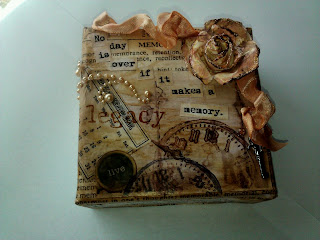
Last night, I finished up one of the altered art canvases.  I really, really like how it turned out.


The canvas was purchased at Michaels.  It measures 4" x 4" and right now you can get a package of 9 of them for $19.99.  I used my 40% off coupon and got mine for $12.00!  I used Tim Holtz's Terminology Tissue Wrap Paper.  I cut out the "memory" part and modpodged it onto the canvas.  While it was drying, I printed off a picture in sepia tones, a tiny December calendar, and the words "No day is over if it makes a memory".  I cut apart the words and modpodged everything to the canvas.

To make the ribbon, I colored 1/2" wide white satin ribbon with a Copic marker (YR00 - Powder Pink).  Then, I wet a small paint brush , dried it a bit, and swiped it across the Gathered Twigs Distress Ink Pad.  I used that to "paint" the ribbon in spots - kind of aging it as I went.  I added more color here, more water there until I achieved the effect I wanted.  I scrunched up the ribbon, held it closed with a binder clip and heated it with my embossing tool.  (CAREFUL:  You have to use the embossing tool sparingly and keep it moving or you'll burn the ribbon!  Also, the binder clip gets HOT!)  Let it cool, take the binder clip off and check to see if the ribbon is dry and it's crinkled enough for your taste.  If not, scrunch the ribbon again and re-heat.

To make the flower, I used ivory paper with a cross hatch texture to it.  I tore out a circle about 3 1/2" in diameter.  Then, I tore the circle into a spiral and finally, rolled the spiral into a flower.  I tinted the flower the same way I tinted the ribbon, using the Gathered Twigs Distress Ink pad, a paintbrush, and some water.  When it was dry, I touched it up here and there with another Copic marker (RV11 - Pink).  I pretty much kept the pink color wherever I had painted with the Gathered Twigs.  I then dragged the Gathered Twigs Distress Ink Pad over the edges of the "petals" to darken them a little more.  Finally, I tipped the edges with Stickles in Frosted Lace.

I hot glued the flower and the ribbon, deliberately placing the ribbon where I liked it.  The embellishment of pearls is from the Recollections collection at Michaels.  I've had the key - can't remember where I got it.  It's hot glued into place, as well.  I also can't remember where I got the clock stamps.  I stamped the clocks in Gathered Twigs and Archival Black Ink from Ranger.  The "live" sticker is from the Typewriter Assorted Dots sheet from Studio 112.  The "legacy" stamp is from Michaels $1 collection.  I stamped it with Copic Marker E57 in Light Walnut.  This method will give you a rather rough outline of the stamp itself, which I kind of like.  It sort of looks distressed already, but sometimes it's hard to read, so I went back over it by hand with the same marker and brought the letters out a little bit more.


The quality of the pictures is a little lacking as my SD card for my camera broke and until I can get another one, I'm using my phone's camera.  I wanted to get this posted for you guys, though, so I hope you'll bear with the picture quality.  Enjoy!

Kathy

Tuesday, February 14, 2012

Unexpected surprise

Hi!

Today, Tim Holtz posted that he was going to break from tradition.  Usually, he does a program called "12 Tags of Christmas", a treat that we Tim-fans eagerly look forward to every year.  But this year, he decided to do the "12 Tags of 2012" instead, creating a tag every month to celebrate different holidays throughout the year.

I had plans to work on some altered canvases tonight - which I did - sort of.  I started them.  Then....I couldn't help myself.  I had to do the Tim tag.  I'm not much for tags - don't use them for anything, so I made mine into a card.

Tim has a place for his followers to post these projects on his blog.  (He's nice like that.  :)  )  I'll be posting mine over there when I'm done here.  For your viewing pleasure....


I started with a piece of white cardstock the same size as the front of the card and ran it through the Vagabond to produce the embossed heart background.  I inked the background with Fired Brick Distress Ink and darkened the edges with Walnut Stain Distress Ink.  Then, I painted the raised hearts with some white acrylic paint.

The ruffled calligraphy print is Tim Holtz Tissue Tape.  It's sticky, so it's very easy to form it into a ruffled effect.  The rose started out as ordinary white tissue paper.  The tissue paper was colored with a Copic Marker, cut, shaped into a flower and hot glued onto the card.  The leaves are made of while vellum, colored with a Copic Marker.  The heart is chipboard, painted white, and glittered with a mixture of two of Martha Stewart's glitters - garnet and brownstone.  The ribbon was white ribbon I colored with the same Copic marker as the rose.  I put together the beads from some jewelry findings I have and attached them to a card with one of Tim Holtz's trinket pins.  Finally, I stamped the tag and inked it with Walnut Stain Distress Ink.  

Sunday, February 12, 2012

Hi all:

I am sooooo ready to create something new, but circumstances of life have occupied my time of late.  Keeping my fingers crossed that sometime in the next few days, I can make a mixed media canvas or two or some shabby chic picture frames - those are next up.  Then I want to try those amazing memory files and the magnetic closures - so much in my brain!!  :)

I finished my paper bag mini album last week, but neglected to post the pictures here.  (I think I did put them on my Kat's Scraps fb page.  Click here to see my fb page.

Anyway, here is the finished product.  I'm quite proud of it.  Do you see the influences of Tim Holtz?  (That's a rhetorical question...)  :)


The little ticket can be filled in with someone's name, a date, or an event - whatever the theme of the album is.

Untied.....

Pages 1 and 2.  The black mat on the left page is for a picture or memento.  The object can be slid under the band with the gear on it.

Pages 1 and 2, displaying the pocket in between and the tags contained in the pocket.  Tags are useful for additional photos, memorabilia, or journaling.

These tags are contained in a pocket built into page 2.  You can see them as they are actually stowed in the pocket if you go back and look at the picture above.

Pages 3 and 4 and the pocket between.  Note the pearls on page 3 in the lower left corner.  Those were white, but I colored them with a Copic marker.  Also, notice the chain and charm attached to the pocket in this one.  I made the charm by applying a sticker to a small piece of black paper, laying the open heart shape charm over the sticker, and filling the charm with Glossy Accents.  Voila!

More tags, pockets, and envelopes.

Pages 5 and 6.  As you'll see below, the flap on page 5 folds down for journaling or additional pics, while the flap on page 6 folds out....

Flap folded down - page 5

Page 6 and pocket between pages 5 and 6

Flap opened on page 6

More tags....

Back cover


  • Paper - "Tattered Time" - DCWV
  • Kraft glassine envelope, metal gears, bead chain, journaling ticket, trinket pin, Gathered Twigs Distress Ink - Tim Holtz
  • Glossy Accents - Ranger
  • Canvas - purchased at Michaels in a single sheet.