Showing posts with label Recollections. Show all posts

Tuesday, November 6, 2012

Learning something new

Hi there!

I saw a card recently that I loved.  It had a piece of subway art on it.  Since I love the look of subway art, I decided to track down the stamp, scrapbook paper, or whatever the card's creator had used to make the subway art.  I had no luck.

While talking to a friend, she mentioned that she planned to make her own with her Photoshop program.  I didn't want to purchase Photoshop because I wasn't sure if I'd like it our how much I would use it.  In the end, I downloaded GIMP.  It works almost the same as Photoshop, but it's free.

There is a learning curve involved with this kind of a photo editing program.  My family can attest to the fact that I spent hours trying to figure out how to do this.  Finally, it was finished.  Looking back, there are some things I wish I'd done differently, but it turned out pretty well, I think.  My brain is full of ideas about how to take this newly acquired skill and run with it.

Anyway,  here is the completed card.


Came out pretty well, I thought.  Black and white isn't a typical color combination for Christmas, but in this case, it works.  I think the touches of red Stickles really added something to it - makes it a bit more Christmas-y.  :)


I've already created another piece of subway art, using the words from a famous Christmas carol.  I hope to post it soon.

Talk to you later!

Kathy


Friday, May 25, 2012

Hidden treasures

Hi all:

I love looking through all of the January CHA releases.  Since winter CHA happens right after Christmas, all of the pretty new things to look at and dream about using are a  great way to escape the winter uglies that happen in February and March. 

This year, there were two new products that really drew my eye.  One was Tim Holtz's Distress Markers because - hello - I'm a Tim Girl.  The other was Heidi Swapp's Memory Files.  What a great way to collect all of the bits and pieces of an event into one compact, easy to store album.  Heidi's Sugar Chic collection is full of bright splashes of aqua, pink, and yellow, set off by stabs of black here and there.  Pure awesomeness!  The cutest embellishments ever are also available.

I couldn't resist combining Heidi's ideas with Tim's flair for the vintage and steampunk.  Here is what I came up with:


The adorable little truck is one of Tim's stamps from The Journey by Stampers Anonymous.  The label on the file folder tab was cut with Spellbinders' Grommet Tags die. 


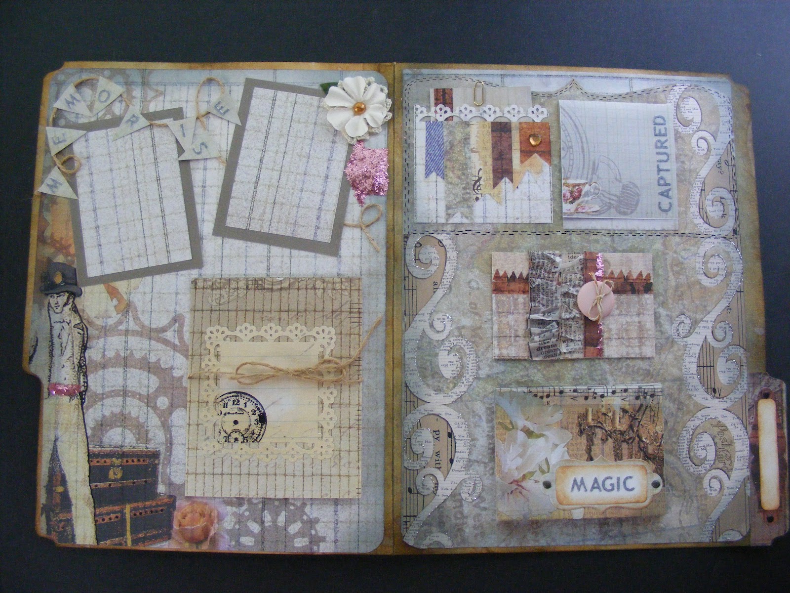
Here is the entire cover.  The gold scrolls were created with Martha Stewart's Craft Clay and the Frames and Flourishes silicone mold.  The flourishes were then painted using Martha Stewart's gold metallic paint.  The paper is Antiquities by Donna Salazar for gcd studios.  This was a plain old manila folder when I started.  It's colored with some of Tim Holtz's Distress Inks - Weathered Wood, Vintage Photo, and Gathered Twigs.

Here are some inside shots:


Same Spellbinders' die, same paper, same distress inks.  The pink tinsel glitter is Martha Stewart's. The silver glitter is Stickles by Ranger.  The ruffled newsprint is Tim Holtz tissue tape, simply gathered into ruffles as it was adhered.  The copper and white twine by Bead Landing, the letters, and the Recollections flowers are all from Michaels.   The letters were white.  I colored them with a gray Copic marker.  :)  The button is an old one - from Bo Bunny, I think.

Here is a complete look at the inside:


This nifty little album lies almost flat when closed, taking up very little space, yet it will hold up to 24 pictures and journaling notes!  Isn't that amazing?!  I love that concept!  That little booklet that say, "Magic" on the bottom right flips open to display 12 pages.  The "Captured" note flips up to display one or two pictures or notes and you can also put something on the front of that if you like.  The button closure hides places for two pictures and a note or three pictures.  It has a magnetic closure.  And the gadget tied with jute on the left side will also hold 3-4 pictures.  And that doesn't even count the front where you can add a title or a picture or both.

I just love this little file.  Hope you enjoyed looking at it!

Kath


Tuesday, April 24, 2012

A Banner Day...

Hello everyone!

May is National Scrapbook Month, and, more specifically, May 5th is National Scrapbook Day.  There is much going on at the store in preparation for this awesome event.

Today, I stayed after work for a few hours.  I'm working on making some attention grabbing items to put around the store to promote NSM.  Last Saturday at crop, I began making a banner.  I found a Recollections paper pad that I really like.  It's a light weight paper - not anywhere near card stock weight - but for what I'm doing, it works well.  I like the colors and I'm hoping we can hang it over the scrapbook aisle.

I've talked about Martha Stewart's Scoring Board before.  I love using this tool.  Martha's products are well made and they often include built in storage for all of the little pieces you need to use with the tool.  This one is no exception.  The scoring tool itself stores inside a little compartment at the top of the scoring board and the triangular piece that's used to make envelopes slides into a convenient slot on the back of the tool.  Excellent!

Primarily, I use this scoring tool to make rosettes of varying sizes and colors.  To make these rosettes, I started with a 12" x 12" paper.  I cut three strips measuring 12" x 3 1/2".  I scored each strip at every 1/2" mark and folded the strips in an accordion style.


In the foreground, two folded strips.  In the background, the last of the three strips, waiting to be folded.

When making rosettes, glue the folded strips end to end.  When all of the strips are glued into one strip, glue the ends of the one strip together to form a perfectly pleated circle.  Set it aside.

Cut out two circles for the center of your rosette.  In this case, the circle I used was 4 inches across.  I wanted a larger circle because I planned to put a letter in the center of each rosette.  The size of the circle is a matter of preference.  It just needs to be big enough to cover the center of the rosette.

The next part is a bit tricky.  Set the pleated circle on end.  Gather the top part of the circle together in one hand and gently pull out the bottom part of the circle with the other hand.  With practice, you'll get a feel for it.  The circle should  kind of splat out.  Glue one cut out circle to the center on the front and one to the center on the back.  Keeping the rosette in formation while gluing on the center circles comes with practice, as well.  I like to use hot glue because it sets and holds almost immediately.

The banner that I'm working on is in shades of green, blue and pink.  Below are some pictures of the completed rosettes on their pennants.


I did get the letters cut out and glued on to each rosette today.  I also glued on the loops for hanging the banner.  But, alas, I forgot to take pictures when they were done.  I will post them as soon as I can.  I will also post pictures of the banner when it's hung.  Stay tuned....

Kath


Wednesday, March 7, 2012

Cure for the Winter Blues

So, last night I'm reading through the blogs and websites on my Google Reader list.  I like to read "A Blog Called Wanda"  (check it out here).  She was talking about The Cure for the Winter Blues Challenge at Moxie Fab World.  I followed the trail of breadcrumbs and was shortly off on another project.

Yesterday, I was thinking that I didn't really have anything creative in the works at the moment.  I've been so busy getting ready for Open House and doing the samples I needed to get done that when Open House was over, I suddenly found myself with some choices and had to step back a bit to look for direction.  This Winter Blues Challenge came at the perfect time and it really did challenge me a bit.

I'm not a huge fan of navy blue.  It's "professional".  I mean, I don't hate it, but I generally don't use it to decorate and I don't dress in it.  As a consequence, I'm kind of short on navy blue items in my stash.  Was I up to this challenge?  Did I even have enough to create something worthwhile?

Winter.  Navy blue.  Night sky.  Crisp.  Clear.  Cold.  Peaceful. "In the stillness of a frosty winter night....peace."  Love that, but...too Christmas-y.  (And in the end, too long for my project.)  Oooo...a Tim Holtz stamp with three pine trees in silhouette.  I can use that.  And.....Martha Stewart's Silver Ink Pad.  Oh, here's some muted silver paper and some glittery snow white paper from the Immortal Stack by Die Cuts with a View.  Oh, yeah...now I'm on a roll.....

I started with white cardstock then layered the silver and the white glittery paper on top, finishing the base of the card with a navy blue layer.  I did find a nice shade of navy blue from Recollections by Michaels, by the way.

With the base layers complete, I pulled out the silver ink pad and inked up the stamp with the three pine trees on it.  I made two impressions.  The first layer was bolder, of course.  To bring one tree out to the forefront, I filled it in with a silver Sharpie paint pen.  Stamping again without re-inking the stamp created the lighter impression, giving the look of trees in the background.  I inked the stamp up again, and stamped a piece of white paper.  I cut out the center tree, colored it in with the silver Sharpie paint pen, and popped it out with some tiny foam pop dots.

To create the look of the hills in the background and write the words, I used a white gel pen by Gelly Roll.

The "stars" are dots made by the silver Sharpie paint pen.  Three Swarovski crystals by Jolee were added for sparkle.  I finished the card off with a sheer navy blue ribbon from Michaels.

Enjoy my cure for the winter blues...  :)


Do be impresssed, won't  you?  It took me forever to get that "star" (crystal) to twinkle just right!  :)


I took this one so you could see the silver trees.  In quite a few of the pictures, the trees looked white.  You can also see two of the crystals in this one.


I like the depth of the trees in this shot.  I really brings out all of the levels.


Twinkle, twinkle little star....  A closer shot of the trees and stars.


Peaceful, isn't it?  See, now....winter isn't quite so bad, is it?  :)


Take care ~
Kath

Thursday, February 23, 2012

Summery sample

Hey there, everyone!

Sorry it's been a few days.  Sometimes life gets in the way...  :)

Michaels is having their annual Open House on Saturday, March 3 from 1:00 - 3:00.  This event showcases the talents of the instructors at Michaels, giving them an opportunity to display their samples of the Michaels curriculum.  Since our store is so new, none of us have samples from past years to draw on, so it's a bit frenzied as we all work to create some spectacular samples for our customers' viewing pleasure.

Not only are we working to make samples, we are also working to make story boards - kind of a portable bulletin board display listing our class offerings.  Some of our samples will be posted on the story boards; some will be displayed on tables.

I am the scrapbook instructor, of course, but the beading, knitting/crocheting, fine arts, and cake making instructors will be there as well.  I'm really excited about spending a couple of hours with my fellow instructors and sharing our crafting enthusiasm with prospective students.

Yesterday, I set out to knock out a few more samples.  I'm very particular about my finished samples, so I put a little extra time into them.  For that reason, I didn't get as many samples done as I would've liked, but I'm pleased with what I finished.

Die Cuts With a View (DCWV) has a stack of papers called Four Seasons.  I picked that up last week because the summer pages really caught my eye and I wanted to play with them.  I picked up two sets, in fact.  One for store use and....one for ME!  :)


I love the country, cheerful, sunniness of these two pages.


So, this is how my day started out:


You'll see a lot of my basic tools in that picture - Tim Holtz's ruler, my Cutterbee detail scissors (LOVE those!), my Fiskars corner rounder punch and one of Martha Stewarts' Punch Around the Page sets.  The other bits and pieces are the logos to put on my story boards.

One other picture of note:


When I'm in "the zone", intense on my work, I tend to set up a semi-circle.  Oh - there's my Recollections paper trimmer.  :)

After four hours of creative fun....


Voila!  I really liked how this turned out - it's so me!  Unfortunately, I don't usually scrap in the 12 x 12 format, so I wouldn't do one of these for personal use.  I might, however, replicate it on a smaller scale for one of my books.....  Stay tuned....  :)

Kathy

Wednesday, February 15, 2012

Altered Art Canvases

Hi all:

Last night, I finished up one of the altered art canvases.  I really, really like how it turned out.


The canvas was purchased at Michaels.  It measures 4" x 4" and right now you can get a package of 9 of them for $19.99.  I used my 40% off coupon and got mine for $12.00!  I used Tim Holtz's Terminology Tissue Wrap Paper.  I cut out the "memory" part and modpodged it onto the canvas.  While it was drying, I printed off a picture in sepia tones, a tiny December calendar, and the words "No day is over if it makes a memory".  I cut apart the words and modpodged everything to the canvas.

To make the ribbon, I colored 1/2" wide white satin ribbon with a Copic marker (YR00 - Powder Pink).  Then, I wet a small paint brush , dried it a bit, and swiped it across the Gathered Twigs Distress Ink Pad.  I used that to "paint" the ribbon in spots - kind of aging it as I went.  I added more color here, more water there until I achieved the effect I wanted.  I scrunched up the ribbon, held it closed with a binder clip and heated it with my embossing tool.  (CAREFUL:  You have to use the embossing tool sparingly and keep it moving or you'll burn the ribbon!  Also, the binder clip gets HOT!)  Let it cool, take the binder clip off and check to see if the ribbon is dry and it's crinkled enough for your taste.  If not, scrunch the ribbon again and re-heat.

To make the flower, I used ivory paper with a cross hatch texture to it.  I tore out a circle about 3 1/2" in diameter.  Then, I tore the circle into a spiral and finally, rolled the spiral into a flower.  I tinted the flower the same way I tinted the ribbon, using the Gathered Twigs Distress Ink pad, a paintbrush, and some water.  When it was dry, I touched it up here and there with another Copic marker (RV11 - Pink).  I pretty much kept the pink color wherever I had painted with the Gathered Twigs.  I then dragged the Gathered Twigs Distress Ink Pad over the edges of the "petals" to darken them a little more.  Finally, I tipped the edges with Stickles in Frosted Lace.

I hot glued the flower and the ribbon, deliberately placing the ribbon where I liked it.  The embellishment of pearls is from the Recollections collection at Michaels.  I've had the key - can't remember where I got it.  It's hot glued into place, as well.  I also can't remember where I got the clock stamps.  I stamped the clocks in Gathered Twigs and Archival Black Ink from Ranger.  The "live" sticker is from the Typewriter Assorted Dots sheet from Studio 112.  The "legacy" stamp is from Michaels $1 collection.  I stamped it with Copic Marker E57 in Light Walnut.  This method will give you a rather rough outline of the stamp itself, which I kind of like.  It sort of looks distressed already, but sometimes it's hard to read, so I went back over it by hand with the same marker and brought the letters out a little bit more.


The quality of the pictures is a little lacking as my SD card for my camera broke and until I can get another one, I'm using my phone's camera.  I wanted to get this posted for you guys, though, so I hope you'll bear with the picture quality.  Enjoy!

Kathy