Showing posts with label Copic Markers. Show all posts

Saturday, October 20, 2012

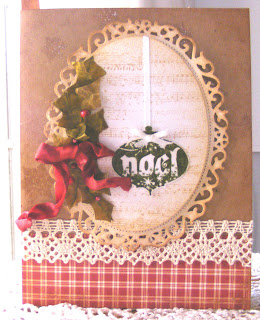
Country Christmas basket

Hi all:

This week, I've been working on a Christmas project.

On November 10, the youth group at my church is sponsoring a harvest dinner and gift basket auction.  They ask for the gift baskets to be donated every year.  What do you think about a Country Christmas gift basket?  I'm creating a set of six cards, three ornaments, and a write on/wipe off board, all done in a vintage country theme.  So far, I have completed five cards.  I got a little carried away on Wednesday night and stayed up all night working on cards.  You girls know what I mean when I say "I was in the zone", right?  Yeah - that's where I was.  I got three cards completed that night and then I slept from 7 AM until noon!


Sooooo...here they are.  Which one is your favorite?


Okay, off to spend time with the family for the day!  Enjoy all!

Kath
  

Friday, May 25, 2012

Hidden treasures

Hi all:

I love looking through all of the January CHA releases.  Since winter CHA happens right after Christmas, all of the pretty new things to look at and dream about using are a  great way to escape the winter uglies that happen in February and March. 

This year, there were two new products that really drew my eye.  One was Tim Holtz's Distress Markers because - hello - I'm a Tim Girl.  The other was Heidi Swapp's Memory Files.  What a great way to collect all of the bits and pieces of an event into one compact, easy to store album.  Heidi's Sugar Chic collection is full of bright splashes of aqua, pink, and yellow, set off by stabs of black here and there.  Pure awesomeness!  The cutest embellishments ever are also available.

I couldn't resist combining Heidi's ideas with Tim's flair for the vintage and steampunk.  Here is what I came up with:


The adorable little truck is one of Tim's stamps from The Journey by Stampers Anonymous.  The label on the file folder tab was cut with Spellbinders' Grommet Tags die. 


Here is the entire cover.  The gold scrolls were created with Martha Stewart's Craft Clay and the Frames and Flourishes silicone mold.  The flourishes were then painted using Martha Stewart's gold metallic paint.  The paper is Antiquities by Donna Salazar for gcd studios.  This was a plain old manila folder when I started.  It's colored with some of Tim Holtz's Distress Inks - Weathered Wood, Vintage Photo, and Gathered Twigs.

Here are some inside shots:


Same Spellbinders' die, same paper, same distress inks.  The pink tinsel glitter is Martha Stewart's. The silver glitter is Stickles by Ranger.  The ruffled newsprint is Tim Holtz tissue tape, simply gathered into ruffles as it was adhered.  The copper and white twine by Bead Landing, the letters, and the Recollections flowers are all from Michaels.   The letters were white.  I colored them with a gray Copic marker.  :)  The button is an old one - from Bo Bunny, I think.

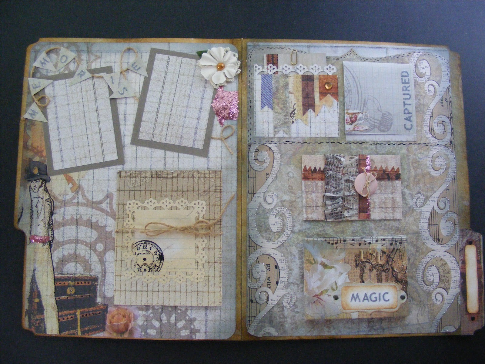
Here is a complete look at the inside:


This nifty little album lies almost flat when closed, taking up very little space, yet it will hold up to 24 pictures and journaling notes!  Isn't that amazing?!  I love that concept!  That little booklet that say, "Magic" on the bottom right flips open to display 12 pages.  The "Captured" note flips up to display one or two pictures or notes and you can also put something on the front of that if you like.  The button closure hides places for two pictures and a note or three pictures.  It has a magnetic closure.  And the gadget tied with jute on the left side will also hold 3-4 pictures.  And that doesn't even count the front where you can add a title or a picture or both.

I just love this little file.  Hope you enjoyed looking at it!

Kath


Sunday, April 1, 2012

Summer Frame of Mind

Hi everyone!

Wow, it's been a while.  I've been pretty busy with several things all at once - some paper related, some not.  I'll be posting as much as I can over the next few days to get you all caught up.

I'm going to begin with the project I finished most recently.  Michaels offers a class called Paper Crafted Gift Frame.  This class was first constructed for Christmas.  Sporting the word "JOY", the background papers were the traditional Christmas colors of red, green, and white.  Obviously, I didn't want to put something related to Christmas out on the store floor at this time of the year.  I'm also kind of beyond spring right now - I'm kind of done with the flowers, chicks, and lace.  So, I opted for a summer theme.  Those of you who know me will smile because I've gone with a beach theme - and I love the beach.

Unfortunately, because this is a class that Michaels offers, I'm bound by their public relations policies, so I can't show you this piece in its entirety.  If you live near me, it's on display at the store and you can check it out back in the frames department.


  • The flowers, some trim, and tag are handmade using paper from the "Four Seasons" pad by Die Cuts With a View.  I LOVE this pad and plan to use every bit of it - not something that happens with every pad of paper I buy, trust me.  
  • The solid colors of paper are French Vanilla, Avalanche, and Turquoise Mist by Bazzill.  
  • I sketched in the seagrass using three different shades of yellow green markers by Copic.  I borrowed one of them from the store, so I can't give you the number for that one, but the other two are YG93 and YG95. 
  •  The tag is hand lettered using a brown Zig marker.  
  • The punch is Martha Stewart's Punch Around the Page in Deco Fan.  
  • The large letters were cut on the Cricut Expressions machine using the Jubilee Celebration cartridge.  I think this was a promotional cartridge that was given away last fall with the purchase of two other cartridges.  I couldn't find it on the Cricut site, so if you find it somewhere, please correct me.  :)
  • The frame is a 14" x 8" (I think) float frame from Michaels.  It comes in black, but I painted it because - ya know - it needed to be kind of beachy.  :)
  • Paints on the frame are by Martha Stewart.  They're Beach Glass and Porcelain Doll in the satin base.    It took several coats of the Beach Glass paint to cover the black, but I love how the frame turned out.  I brushed the Porcelain Doll paint on as a very, very light topcoat.


Sorry for the size and fuzziness of this one, but I cropped it so as not to show too much.  The seashells came from the DCWV pad that I listed above.  I just cut them out and adhered them to a trim strip made of papers and punches that I also listed above.

The word down the middle of the project is "breathe".  I always seem to relax and breathe at the beach - something about that great, uninterrupted expanse of beach and water....


Remember to breathe....
Kathy


Monday, March 5, 2012

Inspiration from Tim Holtz for March

Hi all!

Due  to Open House preparation, I feel a little behind on my blog reading.  Yesterday, I was able to catch up a little bit and...there was Tim's March 2012 Tag!  Yay!!!  I told myself it was too late to get started on it, I have tomorrow off, I can do it then.  That lasted all of about an hour before I gave in.  At 1:00 AM, I decided I was getting dangerously loopy and didn't want to ruin what I'd started.

Again, I did a card rather than a tag.  Tim's tag was a promotion of spring - butterflies and flowers - whereas mine is more about St. Patrick's Day.  You could say I have a little bit of Irish in my background (my maiden name was Ireland), so I love this holiday.  I love the green, the gold, and the rainbow.  I love the wry, humorous Irish blessings.  I love QVC's Irish show - all of the wool sweaters and capes, the Galway crystal, the Belleek china...but I digress...  :)

So, forgive me, Tim for doing something so blatantly "March", but....I couldn't help meself....  :)


The finished product.  There are many parts of this I'm very happy with.  I loved learning the new technique Tim taught us.  The "tiled" or "stained glass" butterflies were the focus of this month's project.  


The butterflies are cut out of grungeboard then covered with double sided super sticky tape.  The tiny pieces of paper are cut and adhered to the butterflies.  Once the mosaic look of the paper snippets were done to my satisfaction, I sprinkled Ranger's Distress Embossing Powder in Black Soot over the butterflies, shook off the excess, and then heated the embossing powder, melting it and making it shiny.  I applied Glossy Accents to the paper pieces, giving them a glassy look, then attached some Swarovski crystals by Jolee to the wings for added sparkle.  This picture doesn't show the colors well.  The paper snippets are in varying shades of greens and creams.  The crystals are peridot or pale yellow in color.  (For more detailed instructions regarding the butterflies, please visit Tim's blog at timholtz.typepad.com )  While the butterflies were drying, I worked on the background.


I started with a sheet of pale gray textured cardstock and ran it through my Vagabond, using the Tim Holtz Sizzix Woodgrain Texture Fade.  To bring out the wood grain, I highlighted the raised parts with the C5 Cool Grey Copic Marker.  I roughened up the edges by scraping my Cutter Bee Scissors along them and then I used Tim Holtz Distress Ink Pad in Weathered Wood to darken the edges.  The scroll is made from regular old run-of-the-mill copy paper.  I went to DaFont.com and downloaded a font called Stonehenge.  (By the way, I know folks are used to seeing Erin Go Bragh, but as I was researching this, I found that the words I used are actually closer to the authentic Celtic version.)  The font size is set at 44 for this one.  After printing off the words, I tore the paper, around the words, leaving extra lengths on both sides of the words.  This allowed room for me to roll the scroll.  I pretty much antiqued the whole paper with Tim Holtz Antique Linen Distress Ink Pad and then went over just the edges with the Vintage Photo Distress Ink Pad.  I rolled the ends of the scroll in opposite directions, holding them there for a few seconds and then, adhered the scroll to the cardstock background.


To make the charm, I used a piece of paper from Tim Holtz Seasonal Paper Stack.  I traced the facet I wanted to use onto the paper, so I could get the sizes correct.  The gold flourish is simply painted on with gold acrylic paint.  


I painted the shamrock with watercolors on watercolor paper and cut it out.  I adhered it next to the gold scroll work on the paper then cut the shape out.  Using Glossy Accents, I adhered the facet to the paper backing, set a heavy object on top of the facet and left it to dry.  When the Glossy Accents was dry, I trimmed the excess paper around the facet.  This is an acrylic facet, also by Tim Holtz.  I used Copic markers G09 - Veronese Green and YG93 - Grayish Yellow to color the ribbon that's threaded through the ring on the facet.  I hotglued the ribbon to the card and voila! - done!

Lots of fun and lot of green St. Patrick's Day goodness!

See you soon ~

Kath


Thursday, March 1, 2012

Punched Cards

Hi all:

I'm still working away at samples for Open House.  In the midst of preparing for that, our bathroom is undergoing some minor renovations, so we have a couple of workmen in the house this week, too.  Also, I worked an extra day this week, so the pressure is on.  I'm tired, tired, tired - but cautiously optimistic about the Open House on Saturday from 1-3.

I still have to put my storyboards together.  One will showcase the classes I offer, so I'm trying to finish up a few things - like paper flowers and cards - to attach to that board.

On Friday, April 13, I will be offering a class called Punched Card Tricks.  This class teaches you how to use a punch in some new and interesting ways.  Most of the time, we simply use a punch to put a decorative hole in the project we're working on, but this class makes you think about other ways to use your punches.

The class offers five cards, but I only have three done so far.  Here are pictures of the three that are finished.  The third one is a little blurry.  I didn't realize that until just now and it's too dark to take another good picture.  I apologize...


I'll try to get the other two finished and posted tomorrow.  I will also work on posting pictures from the open house.  Take care....

Kath

Monday, February 20, 2012

Paper Roses

Hello everyone:

I finished another altered canvas.  This one has many more flowers on it than the first one did and I experimented with different types of papers this time.

I particularly like the way the vellum flowers turned out.  I like the translucent quality of vellum papers anyway, and the texture is always fun to play with.  It has a rather brittle feel to it when you work with it.  Torn edges take on ink in an interesting way, as well.  And when I color on vellum with Copic Markers, the colors don't absorb into the fibers of the paper.  In this way, I can kind of "slide" different colors around on the vellum, play up the strokes at bit, and sometimes create a kind of textured feel to it.  I particularly like to use Copics on vellum to create leaves.  So cool!  You'll see some of them here, though I didn't take a close-ups of the leaves to highlight the texture.  Maybe on another post!  :)

I also like to color ribbon with my Copic Markers.  For this ribbon, I colored it with YG97, then dragged Tim Holtz's Gathered Twigs Distress Ink pad over the ribbon.  I pulled out a small paintbrush and brushed the ribbon with a controlled amount of water.  Water can be reduced or added, depending on your tastes.  Then, I crumpled the wet ribbon, clamped it, and heated it with my embossing gun.  I had to un-clamp, re-crumple, and re-heat about three times to get the ribbon dry and produce the degree of crumpled-ness that I wanted.

I learned something in this process.  The amount of water I used and the lengthy drying/heating time washed out the ribbon in several places.  You will notice how the ribbon took on an almost silvery, rather than green, tint in a few places.  I like it, so I left it.  In the future, though, if I don't want to wash out the color so much, I may have to crumple and air dry (Oh, dear - the patience) or crumple and heat much more sporadically, allowing the ribbon to cool between heatings.  I'm always learning!

The surface of this canvas is covered with Mod Podge and then torn bits of plain old white tissue paper were added.  When that was dry, I inked it with Gathered Twigs, too.  I love that color and am sad that it was produced in a limited edition.  But lucky me - I got one!

Anyway, enjoy!!


Wednesday, February 15, 2012

Altered Art Canvases

Hi all:

Last night, I finished up one of the altered art canvases.  I really, really like how it turned out.


The canvas was purchased at Michaels.  It measures 4" x 4" and right now you can get a package of 9 of them for $19.99.  I used my 40% off coupon and got mine for $12.00!  I used Tim Holtz's Terminology Tissue Wrap Paper.  I cut out the "memory" part and modpodged it onto the canvas.  While it was drying, I printed off a picture in sepia tones, a tiny December calendar, and the words "No day is over if it makes a memory".  I cut apart the words and modpodged everything to the canvas.

To make the ribbon, I colored 1/2" wide white satin ribbon with a Copic marker (YR00 - Powder Pink).  Then, I wet a small paint brush , dried it a bit, and swiped it across the Gathered Twigs Distress Ink Pad.  I used that to "paint" the ribbon in spots - kind of aging it as I went.  I added more color here, more water there until I achieved the effect I wanted.  I scrunched up the ribbon, held it closed with a binder clip and heated it with my embossing tool.  (CAREFUL:  You have to use the embossing tool sparingly and keep it moving or you'll burn the ribbon!  Also, the binder clip gets HOT!)  Let it cool, take the binder clip off and check to see if the ribbon is dry and it's crinkled enough for your taste.  If not, scrunch the ribbon again and re-heat.

To make the flower, I used ivory paper with a cross hatch texture to it.  I tore out a circle about 3 1/2" in diameter.  Then, I tore the circle into a spiral and finally, rolled the spiral into a flower.  I tinted the flower the same way I tinted the ribbon, using the Gathered Twigs Distress Ink pad, a paintbrush, and some water.  When it was dry, I touched it up here and there with another Copic marker (RV11 - Pink).  I pretty much kept the pink color wherever I had painted with the Gathered Twigs.  I then dragged the Gathered Twigs Distress Ink Pad over the edges of the "petals" to darken them a little more.  Finally, I tipped the edges with Stickles in Frosted Lace.

I hot glued the flower and the ribbon, deliberately placing the ribbon where I liked it.  The embellishment of pearls is from the Recollections collection at Michaels.  I've had the key - can't remember where I got it.  It's hot glued into place, as well.  I also can't remember where I got the clock stamps.  I stamped the clocks in Gathered Twigs and Archival Black Ink from Ranger.  The "live" sticker is from the Typewriter Assorted Dots sheet from Studio 112.  The "legacy" stamp is from Michaels $1 collection.  I stamped it with Copic Marker E57 in Light Walnut.  This method will give you a rather rough outline of the stamp itself, which I kind of like.  It sort of looks distressed already, but sometimes it's hard to read, so I went back over it by hand with the same marker and brought the letters out a little bit more.


The quality of the pictures is a little lacking as my SD card for my camera broke and until I can get another one, I'm using my phone's camera.  I wanted to get this posted for you guys, though, so I hope you'll bear with the picture quality.  Enjoy!

Kathy

Tuesday, February 14, 2012

Unexpected surprise

Hi!

Today, Tim Holtz posted that he was going to break from tradition.  Usually, he does a program called "12 Tags of Christmas", a treat that we Tim-fans eagerly look forward to every year.  But this year, he decided to do the "12 Tags of 2012" instead, creating a tag every month to celebrate different holidays throughout the year.

I had plans to work on some altered canvases tonight - which I did - sort of.  I started them.  Then....I couldn't help myself.  I had to do the Tim tag.  I'm not much for tags - don't use them for anything, so I made mine into a card.

Tim has a place for his followers to post these projects on his blog.  (He's nice like that.  :)  )  I'll be posting mine over there when I'm done here.  For your viewing pleasure....


I started with a piece of white cardstock the same size as the front of the card and ran it through the Vagabond to produce the embossed heart background.  I inked the background with Fired Brick Distress Ink and darkened the edges with Walnut Stain Distress Ink.  Then, I painted the raised hearts with some white acrylic paint.

The ruffled calligraphy print is Tim Holtz Tissue Tape.  It's sticky, so it's very easy to form it into a ruffled effect.  The rose started out as ordinary white tissue paper.  The tissue paper was colored with a Copic Marker, cut, shaped into a flower and hot glued onto the card.  The leaves are made of while vellum, colored with a Copic Marker.  The heart is chipboard, painted white, and glittered with a mixture of two of Martha Stewart's glitters - garnet and brownstone.  The ribbon was white ribbon I colored with the same Copic marker as the rose.  I put together the beads from some jewelry findings I have and attached them to a card with one of Tim Holtz's trinket pins.  Finally, I stamped the tag and inked it with Walnut Stain Distress Ink.