Thursday, September 6, 2012

New Goals...

Hi all:

First of all, before I forget, the date for the September Crop has been changed due to scheduling conflicts in the store.  It will now be held on September 29 from 10 - 4.  The cost is $5 and you can come all day or for just a couple of hours.  There are three Cricut machines and several cartridges available for your use, as well as a Cuttlebug, two paper trimmers, and several stamps and punches.  You can work on Christmas cards or your Back to School album.  Bring your pictures, your supplies, and your excitement.  Have a day with the girls!  You deserve it!  :)

I have a new goal.  I would like to be a part of a design team within the next year.  As a member of a design team, the designer or the manufacturer sends you some of their product and an assignment.  You create something with their product, following their guidelines.  Amazing fun!  You get free product, tons of exposure in the paper arts world, and you get to make cool stuff.  Sometimes, you even get paid.  How cool is that?!

Currently, there is a corporation looking for members of their Creative Arts Team.  They asked for four projects demonstrating specific styles they want to see.  So, I put together a couple of things to send in to them.  I must admit I had fun doing them.  I created five things to submit, but these two are my favorites.

The first is a card.  I used one of EK Success's Inkadinkadoo stamps for this card.  I really like the symbolism and appeal of a single flower kept alive in a soda bottle.  Who hasn't done that?  And, sometimes, that single flower - picked at random - means more than  a dozen of the finest roses.  It's a memento - someone was thinking of you.  It's a souvenir of a stroll on an otherwise forgotten summer day.  It's a reminder of the beauty and exquisiteness in the little things that are all around us.  This card reads:  "For you."  "For everything."  Simple.  Heartfelt.


The stamp and ribbon are colored with Tim Holtz's Distress Markers by Ranger.  The crystals are by Jolee's.  The image was stamped on watercolor paper.

The second project is close to my heart because I love the beach - the solitude, the freshness, the warmth, the colors - just love it.  

Here is a clean and simple beach layout:


The stamps are by Clear Art Stamps.  I created the dimensional shell, sand dollar, and starfish with Martha Stewart's Crafter's Clay by EK Success and they were colored with Tim's markers.  I really liked how this one came out - it gives me the same feelings as the beach.  :)

Be back soon.  I'm working on an album from my recent trip to Louisiana.  I'll be sharing it with you soon.  :)

Kathy


Wednesday, July 25, 2012

Christmas in July

In this age of technology, it's a huge frustration when a computer goes down.  Mine went silent on June 12.  Since then, I've limped along with my iPad, but frankly, it just doesn't do everything I'd like it to do.  So, my blog writing has suffered.

The lack of a computer has not hampered me from creating new things, however.  I've been super busy cranking out item after item.  Over the last ten days, I've been feverishly working to get sample items together.  I wanted to use them to apply for Heidi Swapp's media team.  I completed all of the samples, only to find myself stymied by the lack of proper computer technology.  Kind of tough to actively promote your technology skills with...well...technology.  Three hours before the deadline, I gave up.  There will always be next year.

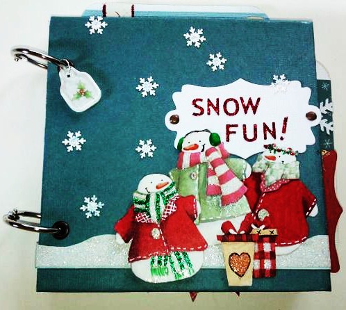
I also recently put together a mini album.  My sister's branch office assembled a "Christmas in July" basket for a company picnic that was held last week.  She asked me to create an album for the basket.  I pulled out my Christmas papers and went to town.  It was kind of fun to bring out the Christmas stuff again.

The album measures 5" x 5" and there is room for a minimum of 18 pictures.  There are four pockets in the album, a tiny "openable" as Heidi Swapp calls them, and lots of pretty things.  My sister was thrilled.  I hope the recipient of the Christmas in July basket was also thrilled!  :)


This page features one of the pockets and some little embellishments on sticks.  It's finished off with some silver and white twine.  Super cute!


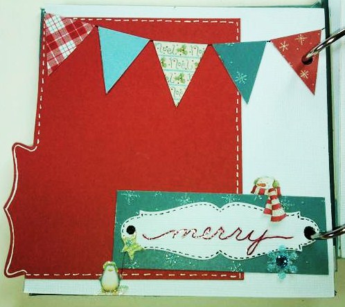
Pennants are a hot theme right now - love these made from lots of pretty papers in the stack.  The embellishments at the bottom include a snowman - his scarf flapping in the winter wind -, a little penguin floating his star shaped balloon, and a sparkly snowflake highlighted with a blue Swarovski crytal.  


Another pennant banner, this one being held up by two cute little snowmen.  This banner floats free of the page so that a picture or journaling can be added under it.  


Another pocket page - this one on the side between the two pages.  I love the cream and blue winter-y colors on this page.  More glittery snowflakes are highlighted....


This pocket holds a journaling tag, or two, if you prefer.  More pretty blue and cream colors.

I love plaids.  This one is so cheery!  More sparkly snowflakes and Swarovski crystals.  
My favorite page of the book!  This is the cover of a mini open-able flip album, as Heidi Swapp calls them.  There is room to mount pictures and journaling on this page, if desired.  But the coolest feature is....wait for it....

The pages flip up to reveal MORE places to put memorabilia, pictures, journaling, notes, or whatever you desire.  On this one small 5" x 5" page, the flip book allows room to store at least five pictures.  Amazing!  More pages of the flip book follow....


This last page is a pocket, too, which allows it to hold more than one picture or memorabilia.  It could also be used to just frame some pictures and skip the pocket altogether.  I love versatility!!  :)


ANOTHER pocket.  More great ways to store things in a small space.  The tag sports red glitter dots along the top edge.   I also love that super glitzy, glittery arrow.  So pretty!


Aren't these guys adorable?!  Love, love, love them!  This is a pocket page, too.  You can see the tag sticking up out of the top of the pocket.  


Here's the tag.  I love the word "this".  Remember this.  Feel this.  Think about this.  Experience this.  Celebrate this.


The back of the "This" tag.  Sweet little bow and some gingham.  You can't go wrong there.  :)

And finally.....


Santa Claus!!!  

I hope you enjoyed this little album.  I had a great time making it.


Friday, May 25, 2012

Hidden treasures

Hi all:

I love looking through all of the January CHA releases.  Since winter CHA happens right after Christmas, all of the pretty new things to look at and dream about using are a  great way to escape the winter uglies that happen in February and March. 

This year, there were two new products that really drew my eye.  One was Tim Holtz's Distress Markers because - hello - I'm a Tim Girl.  The other was Heidi Swapp's Memory Files.  What a great way to collect all of the bits and pieces of an event into one compact, easy to store album.  Heidi's Sugar Chic collection is full of bright splashes of aqua, pink, and yellow, set off by stabs of black here and there.  Pure awesomeness!  The cutest embellishments ever are also available.

I couldn't resist combining Heidi's ideas with Tim's flair for the vintage and steampunk.  Here is what I came up with:


The adorable little truck is one of Tim's stamps from The Journey by Stampers Anonymous.  The label on the file folder tab was cut with Spellbinders' Grommet Tags die. 


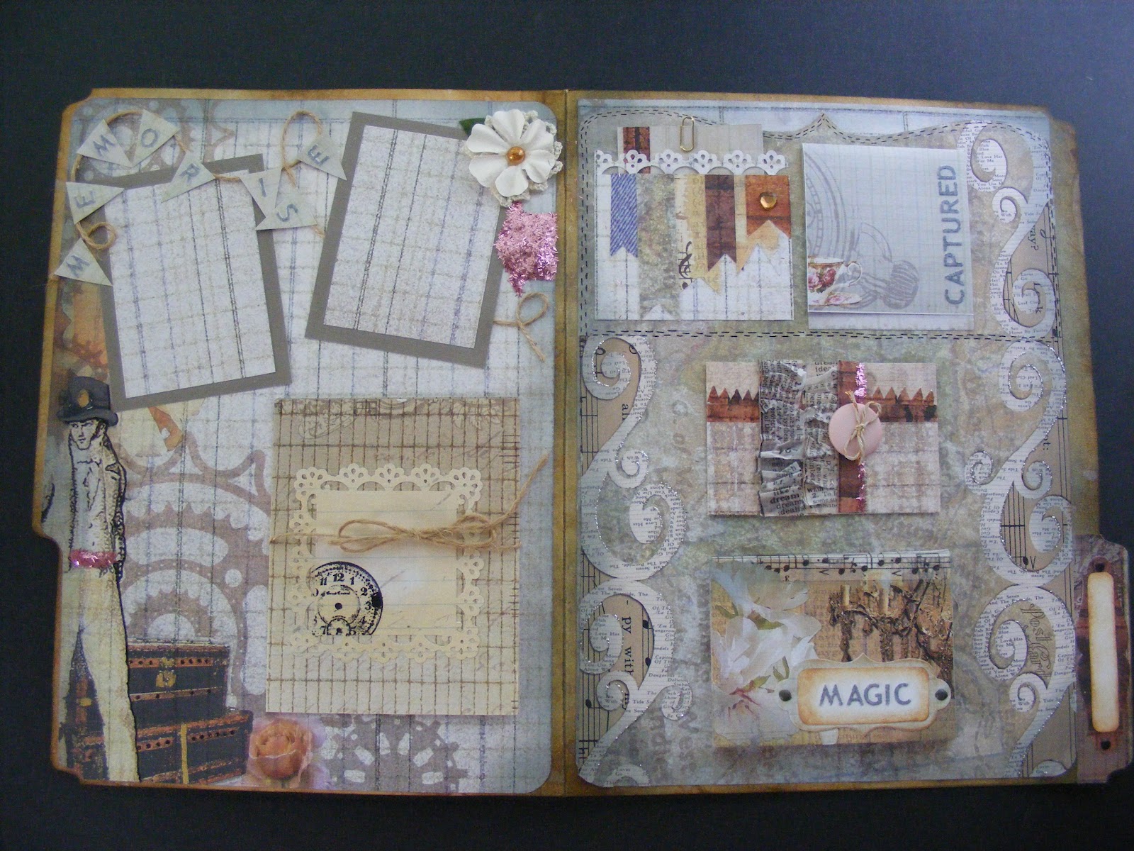
Here is the entire cover.  The gold scrolls were created with Martha Stewart's Craft Clay and the Frames and Flourishes silicone mold.  The flourishes were then painted using Martha Stewart's gold metallic paint.  The paper is Antiquities by Donna Salazar for gcd studios.  This was a plain old manila folder when I started.  It's colored with some of Tim Holtz's Distress Inks - Weathered Wood, Vintage Photo, and Gathered Twigs.

Here are some inside shots:


Same Spellbinders' die, same paper, same distress inks.  The pink tinsel glitter is Martha Stewart's. The silver glitter is Stickles by Ranger.  The ruffled newsprint is Tim Holtz tissue tape, simply gathered into ruffles as it was adhered.  The copper and white twine by Bead Landing, the letters, and the Recollections flowers are all from Michaels.   The letters were white.  I colored them with a gray Copic marker.  :)  The button is an old one - from Bo Bunny, I think.

Here is a complete look at the inside:


This nifty little album lies almost flat when closed, taking up very little space, yet it will hold up to 24 pictures and journaling notes!  Isn't that amazing?!  I love that concept!  That little booklet that say, "Magic" on the bottom right flips open to display 12 pages.  The "Captured" note flips up to display one or two pictures or notes and you can also put something on the front of that if you like.  The button closure hides places for two pictures and a note or three pictures.  It has a magnetic closure.  And the gadget tied with jute on the left side will also hold 3-4 pictures.  And that doesn't even count the front where you can add a title or a picture or both.

I just love this little file.  Hope you enjoyed looking at it!

Kath


Sunday, May 20, 2012

Summer frames

I've been a busy girl for the last week.

In February, a little girl named Isabella was born.  She was premature,weighing only 1 pound and 2.8 ounces.  She had to have surgery to close a hole in her heart.  She is so tiny - so very fragile. And she is already an important member of our community.

This is Isabella at one month old.


In a few weeks, our community is holding a spaghetti dinner fund raiser for Baby Isabella.  There will also be a Chinese auction.  My friend, Tracy, asked me if I could contribute one of my handcrafted items for the Chinese auction.  

I happened to have a couple of unfinished frames and some new Martha Stewart Crafting Clay in my stash, and I had a few ideas running through my head.  On Wednesday night I got down to work.

Here are the final results.  First up is a summery, rather beachy scene, inspired by Webster's Page's new line called the Palm Beach.  I loved the colors in this line and wanted to find a way to work with them.  


There is a quote written around the heart opening that reads, "The cure for anything is salt water - sweat, tears, or the sea."  Isak Dinsen


The other frame is also summery, although it's more about our summer holidays.  So...it's...ya know - patriotic and stuff.


So, which one do you like best?

Monday, May 14, 2012

Cool beach blues....

Hi all:

Occasionally, I break away from paper crafting and get my hands into a different area entirely.  I apologize for those of you who like to read about my paper adventures, but hope you'll enjoy today's post anyway.

My favorite color is blue, but it's a special blue.  It's that Caribbean turquoise -- that "I want to dive into this" blue.  Pool blue.  Beach glass, sea tile blue.  The blue that makes you feel a bit cooler just to look at it.

I recently bought a new t-shirt in that color.  I like to pair my blue with white capris or shorts.  So far, so good. But what could I add to really make it sparkle?

Once day a week or ten days ago, I noticed a new display at Michaels.  On one of the end caps in the jewelry aisle, there was a collection of beach-themed charms.  Seahorses, shells, starfish, sand dollars - all done in an antique-toned silver and set with iridescent blue/green glass.  I didn't have any idea what I was going to do with them, but I bought a set of three charms just because they were so me.  And - hello - blue/green iridescent jewels?  Yum!

They sat on my desk for a while and I looked at them nearly every day, forming ideas in my head.  Last week, all of the beads at Michaels were 40% off.  It was like the universe was practically commanding me to scoop up beads.  I fetched a t-shirt off the shelf in nearly the same shade as my new one and went to work, choosing colors, textures, shapes, and sizes that I loved together.  I came home with eight different packages of beads and went to work.

I finished my project on Saturday night and wore it to church yesterday morning.  What do you think?


I love how it came out.  Right at the bottom, you can see the little starfish and off to the right, about halfway up is the shell.  Way at the top, you can see the tail of the seahorse.  There are so many sea-like beach finds on here, I can hardly stand it!  I love the chunks of shell and the freshwater pearl pieces together.  I also love all of the blues.  I found a few other beads in my stash that were frosted and added little bits of a beach glass touch.  You can see one in the lower left.  Most of the beads are my favorite blue, but I put some greens in there as well.  Here's another look...


The top half of the necklace is simply a chain.  All of the party is in the lower half of the necklace.  It measures about 30" in length, so it's long and slips over my head easily - another thing I prefer.

I love, love, love this and will be wearing it many times this summer with my new t-shirt - and probably with my new white t-shirt as well.

Enjoy that summer-like weather!

Kath

Tuesday, April 24, 2012

A Banner Day...

Hello everyone!

May is National Scrapbook Month, and, more specifically, May 5th is National Scrapbook Day.  There is much going on at the store in preparation for this awesome event.

Today, I stayed after work for a few hours.  I'm working on making some attention grabbing items to put around the store to promote NSM.  Last Saturday at crop, I began making a banner.  I found a Recollections paper pad that I really like.  It's a light weight paper - not anywhere near card stock weight - but for what I'm doing, it works well.  I like the colors and I'm hoping we can hang it over the scrapbook aisle.

I've talked about Martha Stewart's Scoring Board before.  I love using this tool.  Martha's products are well made and they often include built in storage for all of the little pieces you need to use with the tool.  This one is no exception.  The scoring tool itself stores inside a little compartment at the top of the scoring board and the triangular piece that's used to make envelopes slides into a convenient slot on the back of the tool.  Excellent!

Primarily, I use this scoring tool to make rosettes of varying sizes and colors.  To make these rosettes, I started with a 12" x 12" paper.  I cut three strips measuring 12" x 3 1/2".  I scored each strip at every 1/2" mark and folded the strips in an accordion style.


In the foreground, two folded strips.  In the background, the last of the three strips, waiting to be folded.

When making rosettes, glue the folded strips end to end.  When all of the strips are glued into one strip, glue the ends of the one strip together to form a perfectly pleated circle.  Set it aside.

Cut out two circles for the center of your rosette.  In this case, the circle I used was 4 inches across.  I wanted a larger circle because I planned to put a letter in the center of each rosette.  The size of the circle is a matter of preference.  It just needs to be big enough to cover the center of the rosette.

The next part is a bit tricky.  Set the pleated circle on end.  Gather the top part of the circle together in one hand and gently pull out the bottom part of the circle with the other hand.  With practice, you'll get a feel for it.  The circle should  kind of splat out.  Glue one cut out circle to the center on the front and one to the center on the back.  Keeping the rosette in formation while gluing on the center circles comes with practice, as well.  I like to use hot glue because it sets and holds almost immediately.

The banner that I'm working on is in shades of green, blue and pink.  Below are some pictures of the completed rosettes on their pennants.


I did get the letters cut out and glued on to each rosette today.  I also glued on the loops for hanging the banner.  But, alas, I forgot to take pictures when they were done.  I will post them as soon as I can.  I will also post pictures of the banner when it's hung.  Stay tuned....

Kath


Sunday, April 1, 2012

Summer Frame of Mind

Hi everyone!

Wow, it's been a while.  I've been pretty busy with several things all at once - some paper related, some not.  I'll be posting as much as I can over the next few days to get you all caught up.

I'm going to begin with the project I finished most recently.  Michaels offers a class called Paper Crafted Gift Frame.  This class was first constructed for Christmas.  Sporting the word "JOY", the background papers were the traditional Christmas colors of red, green, and white.  Obviously, I didn't want to put something related to Christmas out on the store floor at this time of the year.  I'm also kind of beyond spring right now - I'm kind of done with the flowers, chicks, and lace.  So, I opted for a summer theme.  Those of you who know me will smile because I've gone with a beach theme - and I love the beach.

Unfortunately, because this is a class that Michaels offers, I'm bound by their public relations policies, so I can't show you this piece in its entirety.  If you live near me, it's on display at the store and you can check it out back in the frames department.


  • The flowers, some trim, and tag are handmade using paper from the "Four Seasons" pad by Die Cuts With a View.  I LOVE this pad and plan to use every bit of it - not something that happens with every pad of paper I buy, trust me.  
  • The solid colors of paper are French Vanilla, Avalanche, and Turquoise Mist by Bazzill.  
  • I sketched in the seagrass using three different shades of yellow green markers by Copic.  I borrowed one of them from the store, so I can't give you the number for that one, but the other two are YG93 and YG95. 
  •  The tag is hand lettered using a brown Zig marker.  
  • The punch is Martha Stewart's Punch Around the Page in Deco Fan.  
  • The large letters were cut on the Cricut Expressions machine using the Jubilee Celebration cartridge.  I think this was a promotional cartridge that was given away last fall with the purchase of two other cartridges.  I couldn't find it on the Cricut site, so if you find it somewhere, please correct me.  :)
  • The frame is a 14" x 8" (I think) float frame from Michaels.  It comes in black, but I painted it because - ya know - it needed to be kind of beachy.  :)
  • Paints on the frame are by Martha Stewart.  They're Beach Glass and Porcelain Doll in the satin base.    It took several coats of the Beach Glass paint to cover the black, but I love how the frame turned out.  I brushed the Porcelain Doll paint on as a very, very light topcoat.


Sorry for the size and fuzziness of this one, but I cropped it so as not to show too much.  The seashells came from the DCWV pad that I listed above.  I just cut them out and adhered them to a trim strip made of papers and punches that I also listed above.

The word down the middle of the project is "breathe".  I always seem to relax and breathe at the beach - something about that great, uninterrupted expanse of beach and water....


Remember to breathe....
Kathy